Nutri Zone
UX Design for Social Good
Nutri Zone is a social good app focused on
teaching and helping people on nutrition
The Project
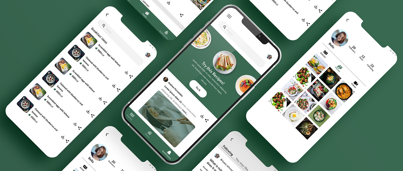
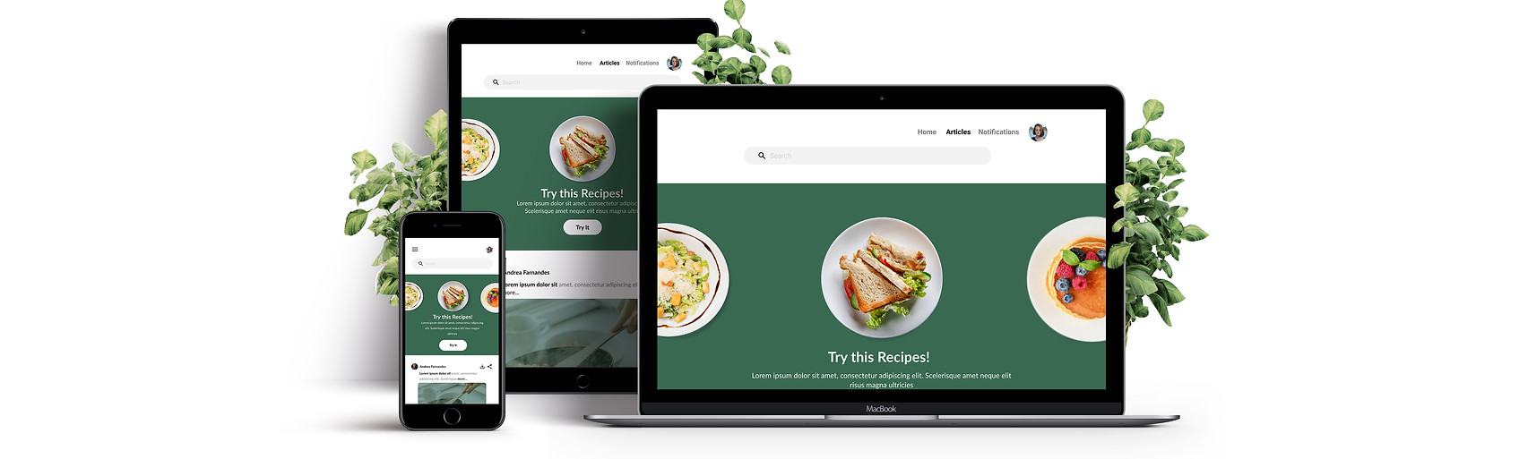
Nutri Zone is a social good app focused on nutrition values. This app is a tool that helps young adults learn about nutrition. Nutri Zone’s primary target users include young adults who are concerned about nutrition in their daily lives and would like to learn and follow the things learned here at Nutri Zone. As a sole UX designer, I created these designs, for which screen size variation including mobile, tablet, and desktop. I optimized the designs to fit the specific user needs of each device and screen size.
Methods
Conducting user interviews, creating paper and digital wireframes, creating low and high fidelity wireframes, user researching, conducting usability studies, iterating on designs.
Tools
Figma, Google Sheets, Google Forms
Context
A large number of young adults often get sick due to a lack of nutrition. Nutri Zone has identified a lack of knowledge about nutrition and a narrow understanding of nutrition and its importance as key reasons for adults being sick. However, not all have the time and knowledge to maintain nutrition. I challenged myself to create an application that works on any device and helps people improve knowledge and follow their nutritional intake in an easy and fun way.
The Process

Research
Interviews
To understand how people made use of existing nutrition learning platforms, which features they thought would help them out, and the issues they are facing, I surveyed 10 people of various age groups. I wanted to understand how the users' answers would vary depending on their age and their situations.
Key Findings & Insights (After the research)
Interviews and some secondary research from the internet helped me to understand more about the needs and frustrations of the users and I was able to get few key findings that would help me to build my project.
1. Fun to use
2. Give a little motivation
Users are unwilling to take a usual approach towards making nutrition a part of their lives. They want it to be fun. Simple to use and easy to follow.
Users were interested to know something extra everything which can motivate them to maintain their nutrition
.png)
User Stories
Finally, I created user stories that I could use to understand the needs of the users, to help understand the requirements, and that I could refer back to throughout the project to keep focused.
Define
Problem Statement
Users need a way to find easily understandable and reliable information every day because they can plan to make decisions about their meals for the day.
User Personas
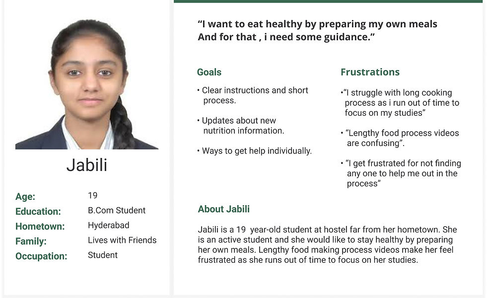
According to the key findings from my user research users of various needs were created namely busy users and confused users. I revisited these personas often to remind myself about the needs and frustrations of my users and to maintain user-centric focus throughout the duration of the project.

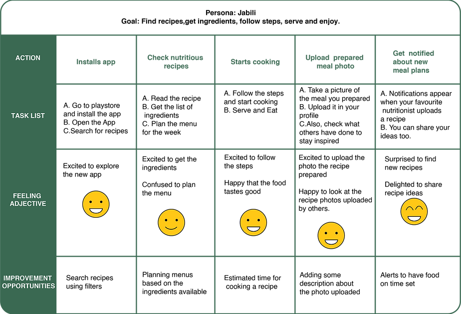
User Journey Map
Core Features

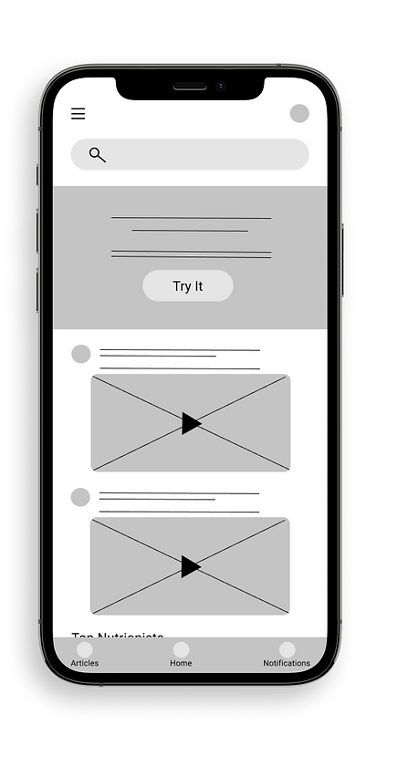
Easy access to app features from global navigation
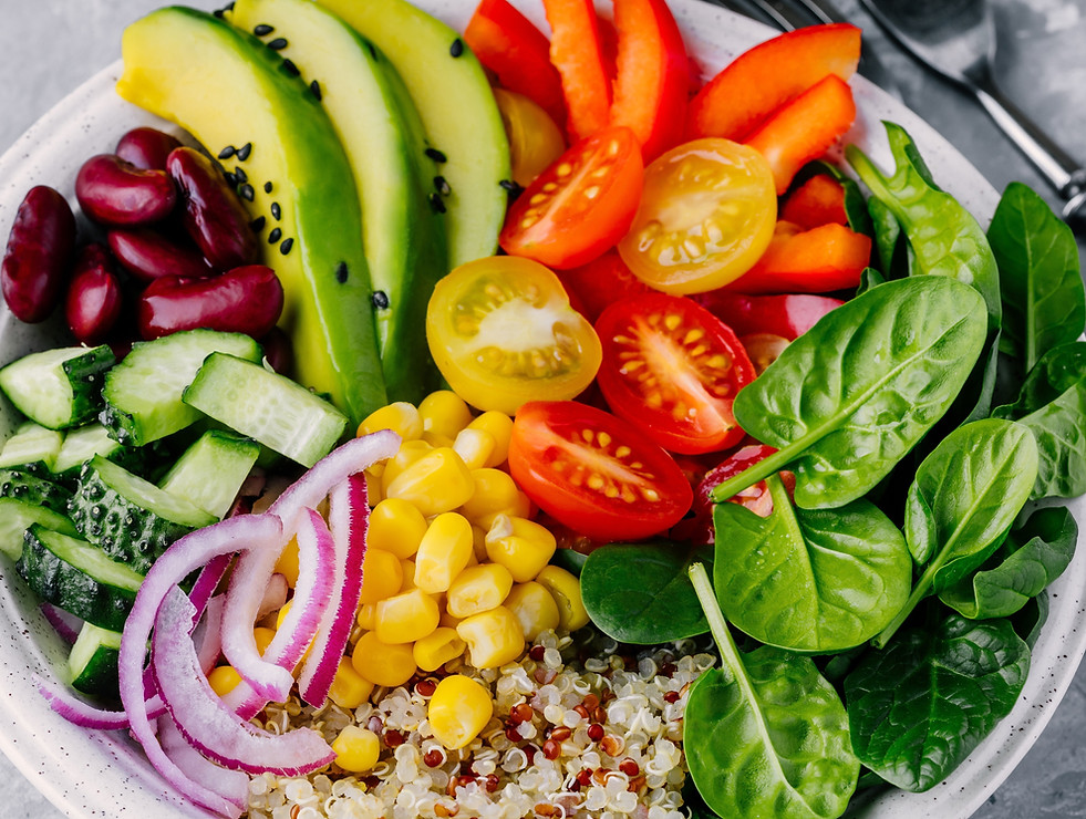
Videos for users and nutritionists gives users good knowledge on nutritional recipe preparation
Core
Features

Ideate
Approach: Progressive Enhancement(Small to Large)
After ideating and drafting on paper wireframes, I created a dedicated app for Nutri Zone. The designs focused on giving a clear tutorial on nutrition and nutritional recipes.
I decided to start creating dedicated mobile app. Designing for the core functionalities of the platform focused on the needs of the users
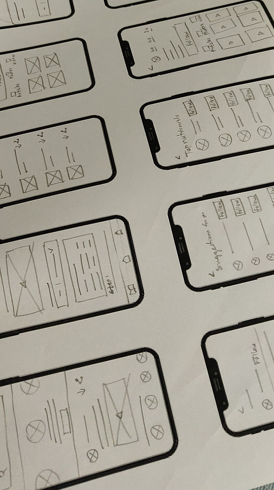
Low-Fidelity wireframes
Test
Usability Study
By conducting usability study I was able to know what users are finding useful and change what they did'nt react well. The users were asked to complete few tasks that would test the features of the app, and were asked how they felt using those. The results were analysed using affinity map.
Key Findings
I found the insights from the themes made from the data which is gathered and organized from the usability study.
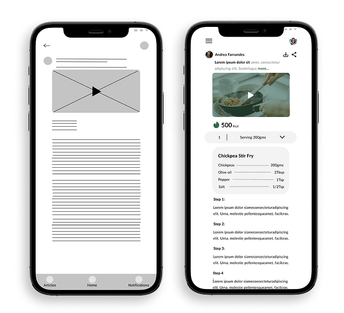
Based on the insights from the usability studies, I applied design changes like providing the serving quantity and calorific value in the video section of the recipe.
Before Usability Study
After Usability Study

500 Kcal

Responsive Website
Sitemap
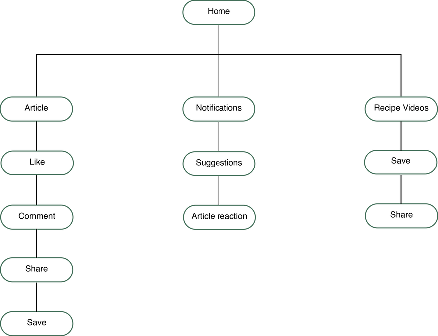
Final designs
Most of the screens in nutrizone's mobile, iPad, and desktop versions make use of one-column content.

Nutri zone's articles page is for reading both the articles written by the people the user follows and the articles which they may like. The selected section is highlighted. The mobile, iPad and desktop versions make use of one-column content for nutrizone.